In this walkthrough we will go through he basics of fitting linear models with sklearn using LinearRegression(). We will look at a simple polynomial model to get started, and focus on understanding how we can use PolynomialFeature() to build a general function on which to build a basic model.
Adding Libraries
import numpy as np
import pandas as pd
import matplotlib.pyplot as plt
import seaborn as sns
A Fishy Data set!
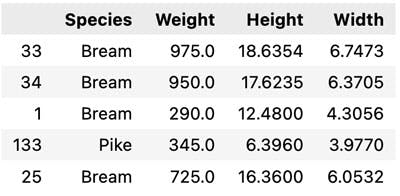
In this data set we are going to look at some fish data of 7 different species, where we will try and predict weight from simple measurements. Important stuff!
In total the data set contains 7 measurements of 159 fish.
df = pd.read_csv('https://raw.githubusercontent.com/satishgunjal/datasets/master/Fish.csv')
df = df.drop(['Length1', 'Length2', 'Length3'], axis =1) # Can also use axis = 'columns'
df.sample(5) # Display random 5 records
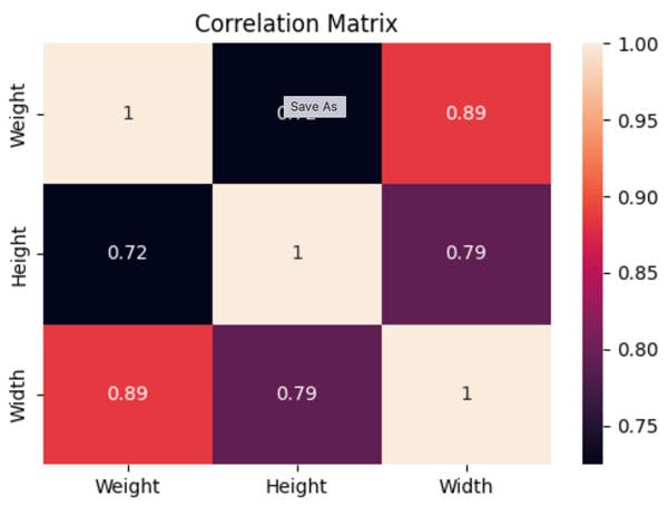
Ok Let us first look at the correlations in the data, for this we calculate and plot a correlation matrix.
df.corr()

plt.rcParams["figure.figsize"] = (6,4) # Custom figure size in inches
sns.heatmap(df.corr(), annot =True)
plt.title('Correlation Matrix')
sns.pairplot(df, kind = 'scatter', hue = 'Species')
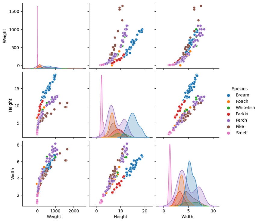
If we want to predict weight, using height looks complex. There looks like two clear responses based on the fish type. Yet making predictions using width, looks like a much more unified relationship, much less depedent on fish type.
So let's do that.
X = df['Width']
y = df['Weight']

X_train, X_test, y_train, y_test = train_test_split(X,y, test_size = 0.2)

plt.scatter(X_train,y_train, alpha = 0.4,color='lightcoral',label='Training Data')
plt.scatter(X_test,y_test, alpha = 0.8,color='lightblue',label='Testing Data')
plt.xlabel('Width')
plt.xlabel('Weight')
plt.legend()
plt.show()
There are clear outliers in this data set, yet since we have sufficient data their influence will be minimal. We could remove them, but we wont here.
Building a Linear Model
Ok so the first simple model we are going to build is a polynomial model, which looks like this
So here we talk about being the feature vectors, in this case they a polynomial features; really easy to do in ``sklearn`.
from sklearn.linear_model import LinearRegression
from sklearn.preprocessing import PolynomialFeatures

polynomial_features= PolynomialFeatures(degree=2)

phi_train = polynomial_features.fit_transform(np.array(X_train).reshape(-1,1))

lr = LinearRegression().fit(phi_train, y_train)
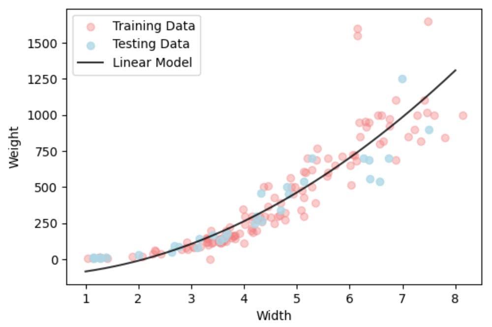
Ok so now let us plot out the function and compare it to the data.
X_all = np.linspace(1.0, 8.0, 1000).reshape(-1,1)
X_plot_poly = polynomial_features.fit_transform(X_all)
y_pred = lr.predict(X_plot_poly)
plt.scatter(X_train,y_train, alpha = 0.4,color='lightcoral',label='Training Data')
plt.scatter(X_test,y_test, alpha = 0.8,color='lightblue',label='Testing Data')
plt.plot(X_all,y_pred,'-k',alpha = 0.8,label='Linear Model')
plt.xlabel('Width')
plt.ylabel('Weight')
plt.legend()
plt.show()

It isn't a good model. Ok it fits on average ok, but we know that weight can't be negative. So we need to impose constraints.
sklearn gives us some options.
lr_positive = LinearRegression(fit_intercept = False, positive = True).fit(phi_train, y_train)
y_pred_positive = lr_positive.predict(X_plot_poly)

plt.scatter(X_train,y_train, alpha = 0.4,color='lightcoral',label='Training Data')
plt.scatter(X_test,y_test, alpha = 0.8,color='lightblue',label='Testing Data')
plt.plot(X_all,y_pred,'-k',alpha = 0.8,label='Linear Model')
plt.plot(X_all,y_pred_positive,'-g',alpha = 0.8,label='Linear Model w. +ve constraint')
plt.xlabel('Width')
plt.ylabel('Weight')
plt.legend()
plt.show()
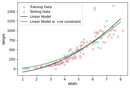
Our model now at least make physically meaning predictions, although we see the performance of the model is reduce, particular at smalle width values.
How might we do better?
- Get rid of outliers?
- Try a different form of linear model?
- Apply a transform of the data first? If so, then what might you try?