Trying out Clustering with K-Means
In this walkthrough we can are going to explore K-means on a crime data set across all US states. Which states have similar crime profiles?
Import Libraries
import numpy as np
import pandas as pd

from sklearn.linear_model import LinearRegression
from sklearn.model_selection import train_test_split

import matplotlib.pyplot as plt
%matplotlib inline
Import Data Set and have a look
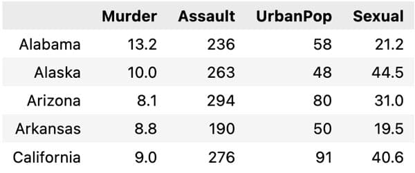
Let us have a look at the data.
df = pd.read_csv("data_arrest.csv", delimiter=",", index_col=0)

df.head()

Rescaling data is important when using K means. This is because the different inputs can have different scales. Hence if not rescaled some variables will have a greater influence than others.
Here we use the normal MinMaxScaler() which rescales the data from 0 to 1 for each input variable.
from sklearn.preprocessing import MinMaxScaler

minmax = MinMaxScaler()

hat_df = crime_rates_standardized = pd.DataFrame(minmax.fit_transform(df))
Clustering with K Means
Here we now fit a K Means model, and we try out different values of K (the number of clusters). In each case we can calculate the inertia (the total distance from the data to the centroid of the cluster it is assigned).
from sklearn.cluster import KMeans

KMeans()
plt.figure(figsize=(8, 6))
inertia = []
for i in range(1, 11):
    kmeans = KMeans(n_clusters = i, init = 'k-means++', n_init='auto',random_state = 123).fit(hat_df)

    inertia.append(kmeans.inertia_) # criterion based on which K-means clustering works
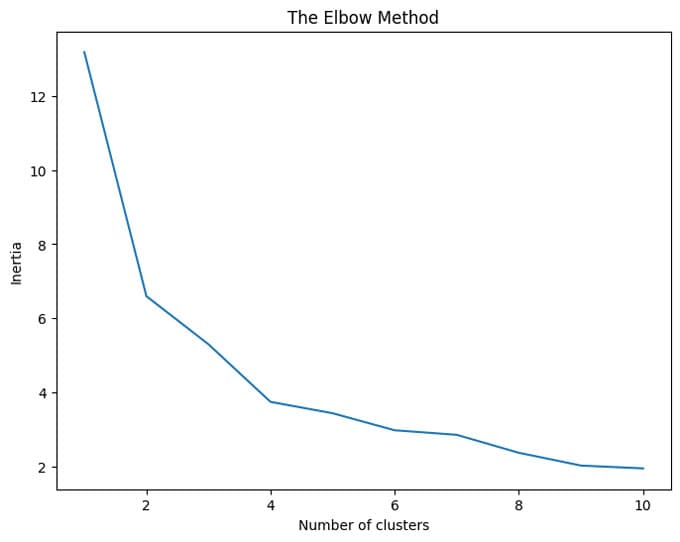
We can then plot the 'elbow' curve and see a good choice of number of clusters
plt.plot(range(1, 11), wcss)
plt.title('The Elbow Method')
plt.xlabel('Number of clusters')
plt.ylabel('Inertia')
plt.show()

Looking at the elbow curve we see that K = 4 seems a good choice. So let us fit that model again, and look at the results.
model = KMeans(n_clusters = 4, init = 'k-means++', n_init = 'auto', random_state = 42)

clusters = model.fit_predict(hat_df)

scatter = plt.scatter(df['Murder'], df['Assault'], c=clusters)

plt.xlabel('Murders Rates')
plt.ylabel('Assaults Rates')
plt.show()
There seems like a clustering which divided by the amount of crime. We see a clear correlation between murder rates and assault rates (no really surprise here). The clustering is clear visible along this relationship.
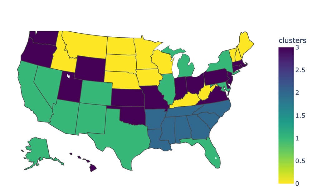
Now let plot this data set on a map. We do this using plotly which you can install using
pip install plotly-express
First we need to convert state names into the abbrevation of two letters, and then add them to the data set along with the assigned cluster numbers.
import plotly.express as px # You can install this using `pip install plotly-express`

us_state_to_abbrev = {
    "Alabama": "AL",
    "Alaska": "AK",
    "Arizona": "AZ",
    "Arkansas": "AR",
    "California": "CA",
    "Colorado": "CO",
    "Connecticut": "CT",
    "Delaware": "DE",
    "Florida": "FL",
    "Georgia": "GA",
    "Hawaii": "HI",
    "Idaho": "ID",
    "Illinois": "IL",
    "Indiana": "IN",
    "Iowa": "IA",
    "Kansas": "KS",
    "Kentucky": "KY",
    "Louisiana": "LA",
    "Maine": "ME",
    "Maryland": "MD",
    "Massachusetts": "MA",
    "Michigan": "MI",
    "Minnesota": "MN",
    "Mississippi": "MS",
    "Missouri": "MO",
    "Montana": "MT",
    "Nebraska": "NE",
    "Nevada": "NV",
    "New Hampshire": "NH",
    "New Jersey": "NJ",
    "New Mexico": "NM",
    "New York": "NY",
    "North Carolina": "NC",
    "North Dakota": "ND",
    "Ohio": "OH",
    "Oklahoma": "OK",
    "Oregon": "OR",
    "Pennsylvania": "PA",
    "Rhode Island": "RI",
    "South Carolina": "SC",
    "South Dakota": "SD",
    "Tennessee": "TN",
    "Texas": "TX",
    "Utah": "UT",
    "Vermont": "VT",
    "Virginia": "VA",
    "Washington": "WA",
    "West Virginia": "WV",
    "Wisconsin": "WI",
    "Wyoming": "WY",
    "District of Columbia": "DC",
    "American Samoa": "AS",
    "Guam": "GU",
    "Northern Mariana Islands": "MP",
    "Puerto Rico": "PR",
    "United States Minor Outlying Islands": "UM",
    "U.S. Virgin Islands": "VI",
}

abbrev_state = []
for state in df.index:
    abbrev_state.append(us_state_to_abbrev[state])

df['state_code'] = abbrev_state
df['clusters'] = clusters

df.head()

We can now plot this map using plotly-express
fig = px.choropleth(df,
                    locations='state_code',
                    locationmode="USA-states",
                    scope="usa",
                    color='clusters',
                    color_continuous_scale="Viridis_r",
                    )
fig.show()
